Course Site Design Considerations
There are some instructional design choices that will make your online course site more accessible to your students. Many of these choices are supported by the tools and technologies¬†available at AVĺ„ņ÷≤Ņ.
Fonts and Colours
The fonts and colours you use in your course content can affect its accessibility. Generally, screen¬†readability¬†is improved by using a¬†sans-serif¬†font (i.e., one without a small decorative line or taper at the end of¬†the¬†stroke) at a size of 12-16 point.ŐżThe default font in Brightspace is Lato, which is sans-serif, at a size of 19 pixels (equivalent to 14.25 point).
At the same time, some sans serif fonts are not as accessible because of what‚Äôs called ‚Äúmirrored shapes,‚ÄĚ where certain letters and numbers (e.g., uppercase I, lowercase L, and the numeral one) and punctuation (apostrophes, quotation marks) have similar shapes.
Long story short, here are some fonts that you can use for online or in documents (whether printed or displayed on a screen): Aptos, Arial, Calibri, Helvetica, Garamond, Georgia , Tahoma, Times New Roman and Verdana.
Colour can also affect readability.ŐżBlack text on a white background is preferable to white text on a black background.ŐżHigh¬†colour¬†contrast (black on white) is preferable to low contrast (other colours on white).
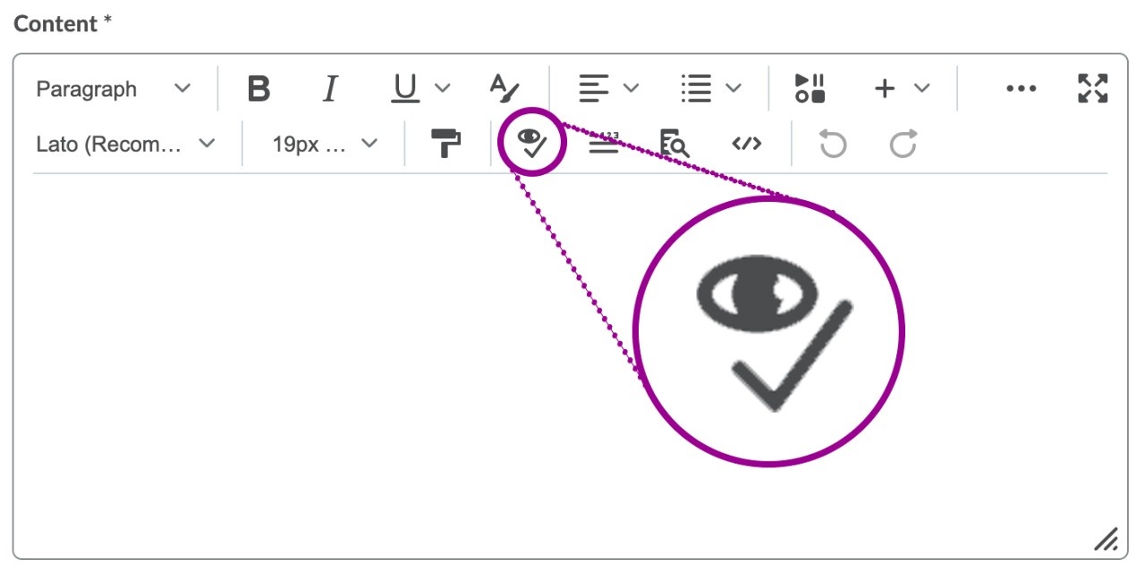
Colour contrast and other features can be checked in Brightspace by using the Accessibility Checker feature on any of the text input boxes, such as those in Announcements, Content, Discussions, etc.

Text Materials
When providing readings or other texts to students, ensure that it is¬†actually text¬†(i.e., machine-encoded text) versus an image that looks like text.ŐżSometimes it can be hard to tell the difference, especially with PDFs. To check, try to highlight the text with your cursor. If you can select it, it‚Äôs probably text.


Text can be read by a screen reader and enlarged with a¬†screen magnifier.ŐżScreen-reader friendly text materials¬†can be read by¬†ReadSpeaker¬†in Brightspace, Immersive Reader in Microsoft Word, and other forms of assistive technology.ŐżText can also be searched, whereas a scanned image of text cannot.
Captions for Rich Media
For audio or video¬†content, providing captions is required to ensure students¬†can¬†access¬†the materials.ŐżCaption files can also be converted to transcripts, which may also support students who have¬†note-taking as an accommodation.Őż
Panopto,¬†AVĺ„ņ÷≤Ņ‚Äôs audio and video creation and hosting platform,¬†offers automatic captioning.ŐżIf the automatic captioning is not meeting your needs,¬†Academic¬†Technology Services (ATS) offers¬†human captioning support¬†to edit and correct automatic captions.
Images
When you use images in your course content online, include a text alternative (called alt-text) that describes the picture in detail. This is especially important when an image is used to convey information or has meaning. When inserting an image into Brightspace, it will prompt you to include alt-text, if the image is not purely decorative.Őż
Keep your description short but also specific. And because it‚Äôs a description of an image, you can leave out¬†words like ‚Äúphotograph of‚ÄĚ or ‚Äúpicture of.‚Ä̬†For the image below, alt-text could¬†be:¬†an avocado split into two halves.

